
This tutorial aims to help students create a simple map using Google Fusion Tables. Google Fusion Tables is an online data management application that enables you to share and publish data on the web. It also allows you to visualize this data in different ways, including in various charts and maps. Ease of use aside, the greatest benefit of creating a map with Fusion Table is that the application allows you to utilize the functions and information found in Google Maps.
There are, however, currently downsides to the maps created through Fusion Tables. The application may be useful to you as you embark on your final research projects but is not suitable for the ESTC/Zotero skills assignment. The reason for this is simple, Fusion Table maps do not allow you to show information for more than one record assigned to a particular location. If multiple records originate from the same location, only the information for the first record listed in your Google Sheets document will appear as an icon on the map. If you have 52 records for books published in Philadelphia in 1812, for example, only the first record listed in spreadsheet will appear on the map.
That said, Fusion Table maps is a fast and effective way to visualize geographic information. Google Fusion Tables perform similar functions to spreadsheet files that you may have worked with in the past, including Microsoft Excel and Google Sheets documents. This tutorial focuses on the map and the chart functions for this application. I have decided to use the publication history of Thomas Paine’s Common Sense for the year 1776. But before we explore the mapping function and other visualization functions.
I) Creating a Fusion Table
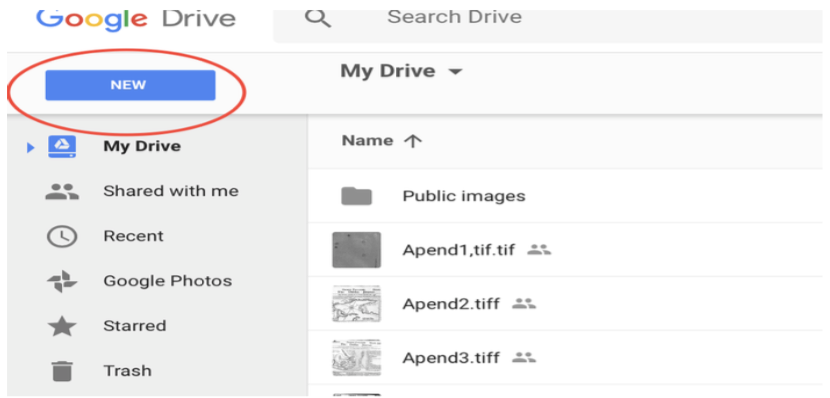
I will first demonstrate how to create a Fusion Table in Google Drive and how to import information from a Google Sheets or Microsoft Excel document into a Fusion Table. To create a Fusion Table, you first must download the app to your Google Drive account. First, sign into your Google account. In the upper righthand corner you will see the “New” option. This option enables you to create a new file. Click on the “New” option and scroll down to the “Connect more apps” bar at the bottom of the list.
You will not see the “Fusion Tables” result automatically so you will need to type “fusion tables” in the “Search Apps” box and hit the press the “enter” key. Click the “Fusion Tables (experimental)” app. Fusion tables should now be an available option whenever you click on the “New” file option in you Google Drive.
You can now create a new Fusion Table by clicking on the “Fusion Table” option in the “New” file dropdown menu. Once you choose this option you will be presented with this screen:
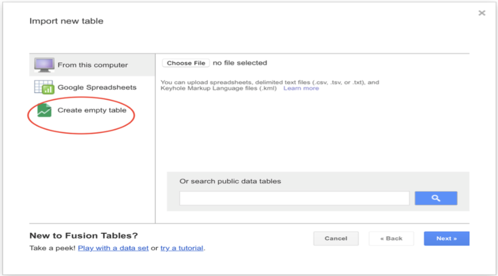
Click on the third option to create a new Fusion Table, as indicated in the image above.
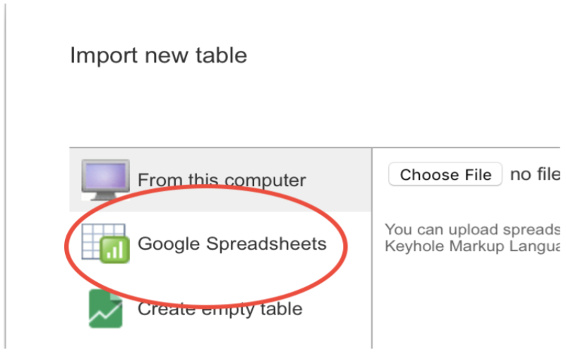
But what if you would like to convert a preexisting file into a Fusion Table document? The good news is that the conversion process is straightforward and quick. When confronted with the menu above, choose the second option “Google Spreadsheets.” This option, shown in the image below, allows you to convert a Microsoft Excel or Google Sheets document in your Goggle Drive to a Fusion Table.
Google will walk you though several steps in order to create a new table. Follow these instructions. Viola! You will now find a Fusion Table containing the same name as the original Excel or Sheets file in your Drive.
II) Working with Fusion Tables
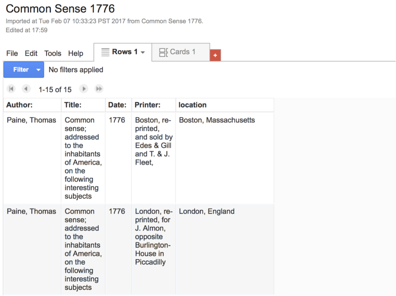
Now that you can create Fusion Tables, let’s create a document that will plug information into two different types of maps and a network graph. For the purposes of this exercise I have decided to use the publication history of Thomas Paine’s Common Sense for the year 1776. Please convert the .csv file provided into a Fusion Table using the steps outlined in Part I of this tutorial.
The Fusion Table should contain the following information in five columns (the vertical rows) with the following information: author, title, date, printer, location. Each row (horizontal rows) contains information pertaining to a particular edition of the pamphlet published in 1776. Your Fusion Table should look like this:
1) Creating maps
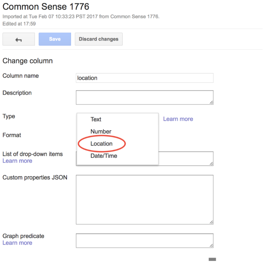
The first thing to do before creating a map is to make sure that your geographic or location information is labeled so that Fusion Tables can identify it correctly. Click on the column heading that contains your geographic data, in the case of our Tom Paine example the column labeled “location” contains our location specific identifiers. Click the “Change” option in the dropdown menu.
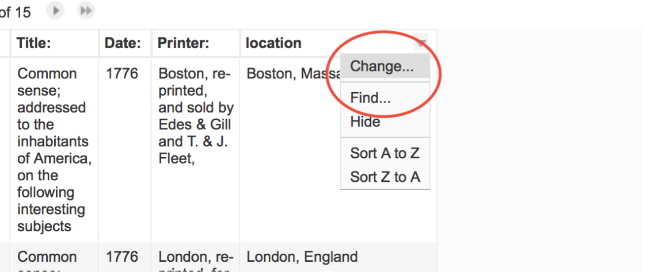
Once you select “Change” you will be presented with another set of options. You will see that “Text” is default setting in the “Type” box. Click on the “Type” box and select “Location” instead. Now click “Save.”
You are now ready to create a map!
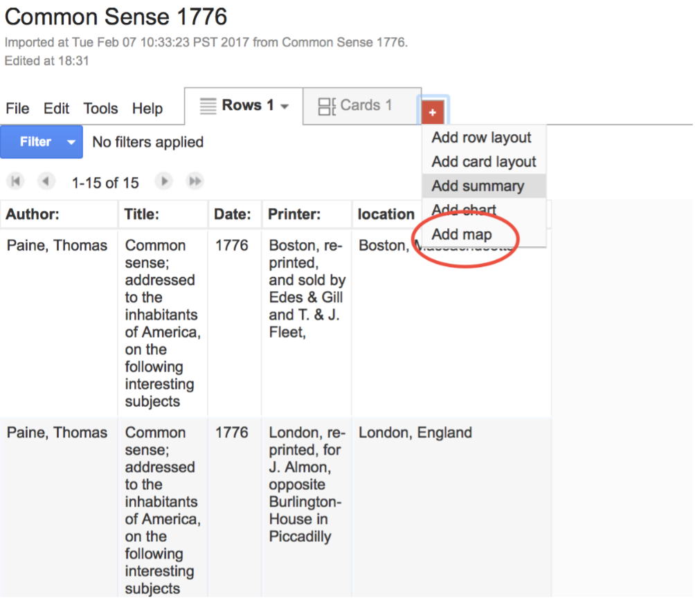
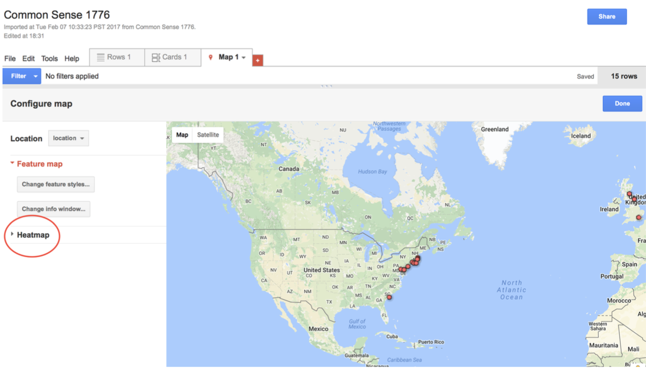
To create a feature map (a map that displays specific locations linked to the information contained in the Fusion Table) add a new tab by clicking the red “+” box to the right of the “Cards 1” tab. Now choose the “Map” option.
Congratulations you should now see this map!
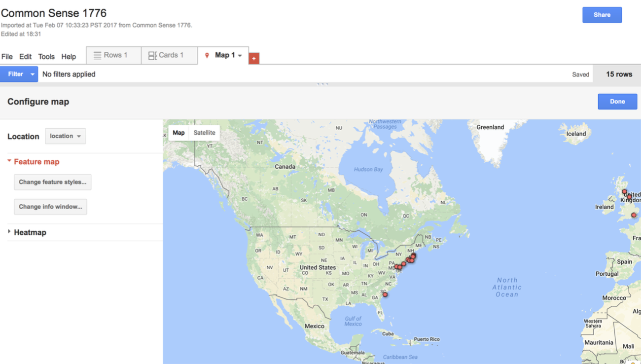
You can click on any of the red tabs placed in the map to see the publication information contained in your Fusion Table.
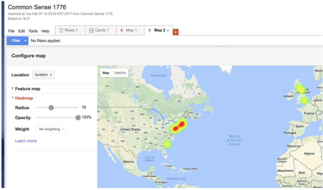
Let’s now attempt to create a heat map. A heatmap is a graphical representation of data where the individual values are represented as colors. This allows you to visualize the frequency of given values (like the publication of a given book in a single city or area) as color intensity.
Click on the “+” tab to create a new map by repeating the steps listed above. Now click “Heatmap” in the “Configure map” menu on the left of your screen.
You should then see this screen. You can adjust the radius and opacity of each point on the map in the menu on the left of your screen.
III) Creating a Network Graph
We will now create a network graph using the Common Sense data in our sample Fusion Table. A Network graph allows you to visualize the relationships between different variables in your tables (place of publication and book title, for example).
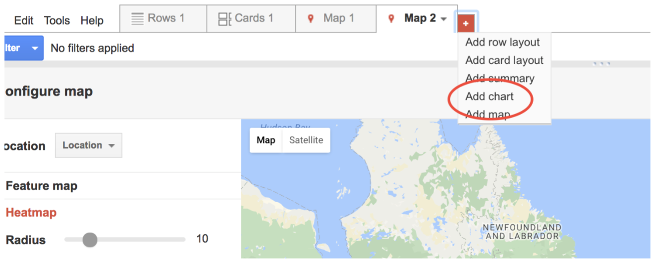
To create a graph click on the red “+” tab in your chart. Choose the “Add chart” option from the dropdown menu.
You will now be asked to configure the graph. Under the “Show link between” options on the left side of your screen, choose to show the link between “Title” and “Location.” In the “nodes” box above the chart change the number of nodes on display to 16. You should now see this chart:
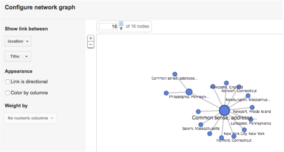
Note that Philadelphia has two separate nodes emanating from it. This is because the title differs slightly from the titles listed in the other 16 examples. The reason for this is because Paine published 3 editions of Common Sense in Philadelphia in 1776. Each edition is listed separately in the chart.
Take some time to play around with this display. You can, for example, change the color of the nodes in the chart to reflect difference by checking the “Color by columns” option in the left.