In Part I, we scraped data about books and their borrowers from Dissenting Academies Online; in Part II, we wrangled that data into shape using Google Sheets. Now it’s time to download that wrangled data so we can upload it to Kumu to visualize the connections between books and borrowers (and, by extension, the connections between people that those books might have forged).
Downloading our data from Google Sheets
The first thing to do is to download the data we prepared in Part II as an Excel file. Kumu can import data directly from Google Drive, but we can’t edit the data in Kumu when it’s being pulled from Google Sheets. Downloading the data and uploading it to Kumu ourselves will give us some more control over how things look and work, should we need it.
We’re only going to need two of the sheets in our workbook—the Elements and Connections sheets. If you have a spreadsheet program that can open .xlsx files and save to .xslx format installed on your computer (e.g., Microsoft Excel, Libre Office, Apple’s Numbers), it’s easy enough just to download the whole Google Sheets workbook in Excel format [in Sheets: Download as > Microsoft Excel (.xslx)], then open the workbook in your spreadsheet program and delete the unneeded sheets. If you don’t have a spreadsheet program installed, you could make a copy of your Google Sheets file and delete the unneeded sheets in that new copy before downloading it.
However you choose to do it, you should end up with a file in .xlsx format that includes two sheets: “Elements” and “Connections.
Uploading to Kumu
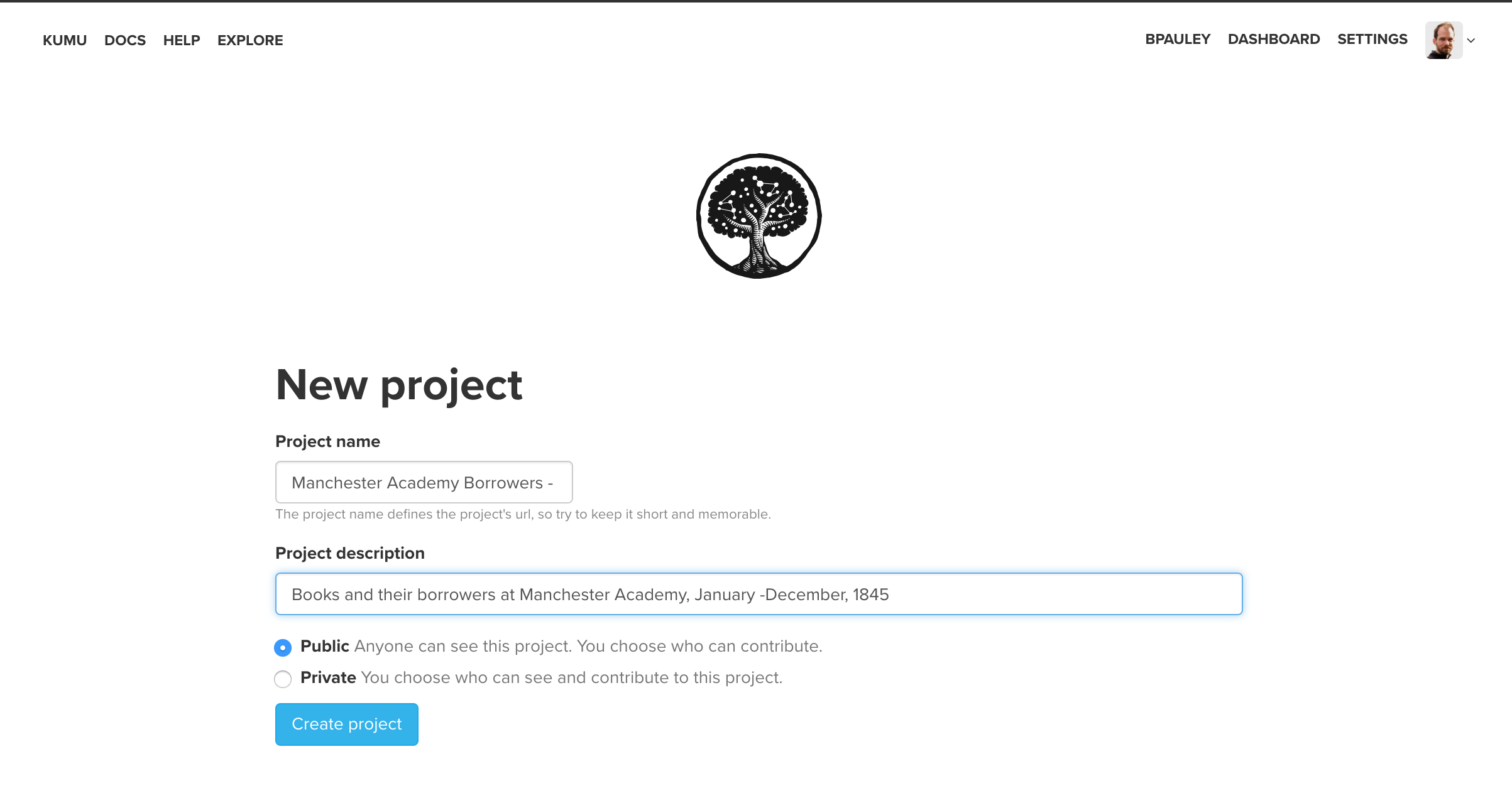
You’ll need to set up a free account at Kumu if you haven’t done so already. Once you’re logged in at Kumu, it’s time to start a new project.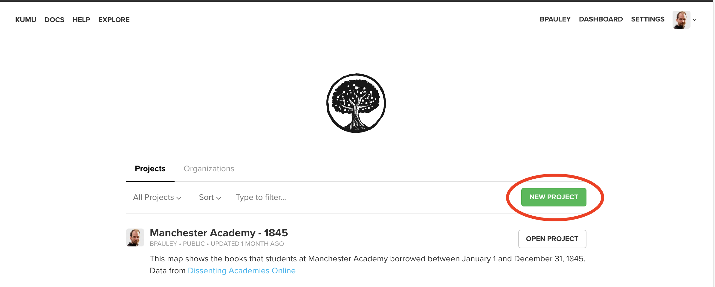 Give your project a name and a brief description. Free Kumu accounts can only create public projects—we’d need to upgrade to a paid account to restrict our project.
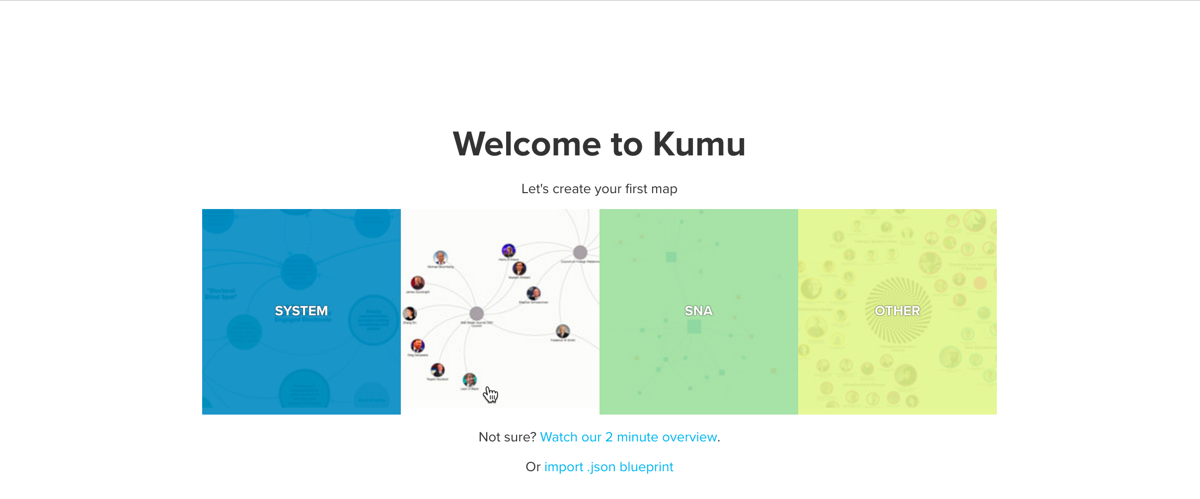
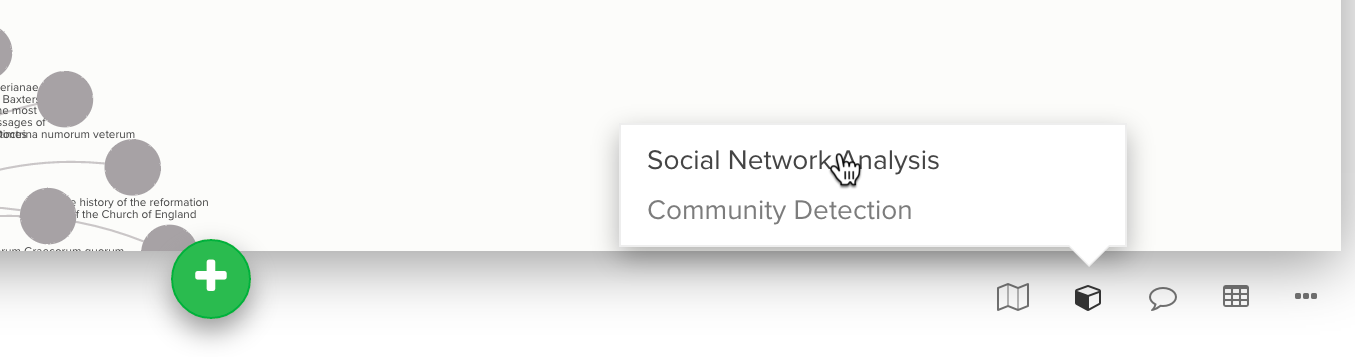
 Kumu offers a few different formats. For this project, we’ll use the “Stakeholder” map. (The “Social Network Analysis” map would be another choice: as they describe it, it’s optimized for performance, so it’s good for handling larger data sets, but at the expense of not allowing you to customize as many aspects of its appearance.)
Now we provide a name for our visualization (each “project” can support more than one “map”):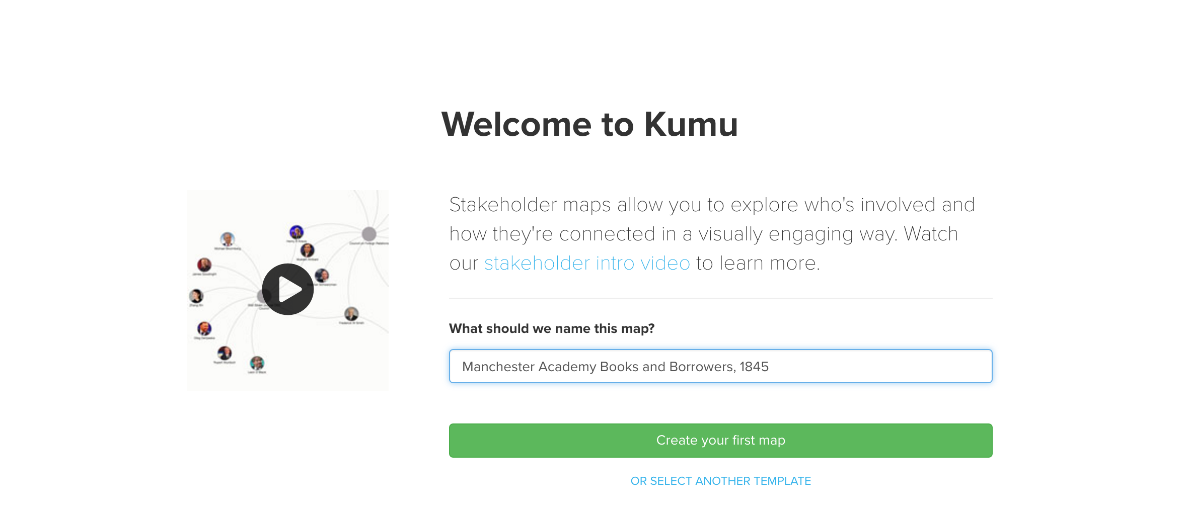
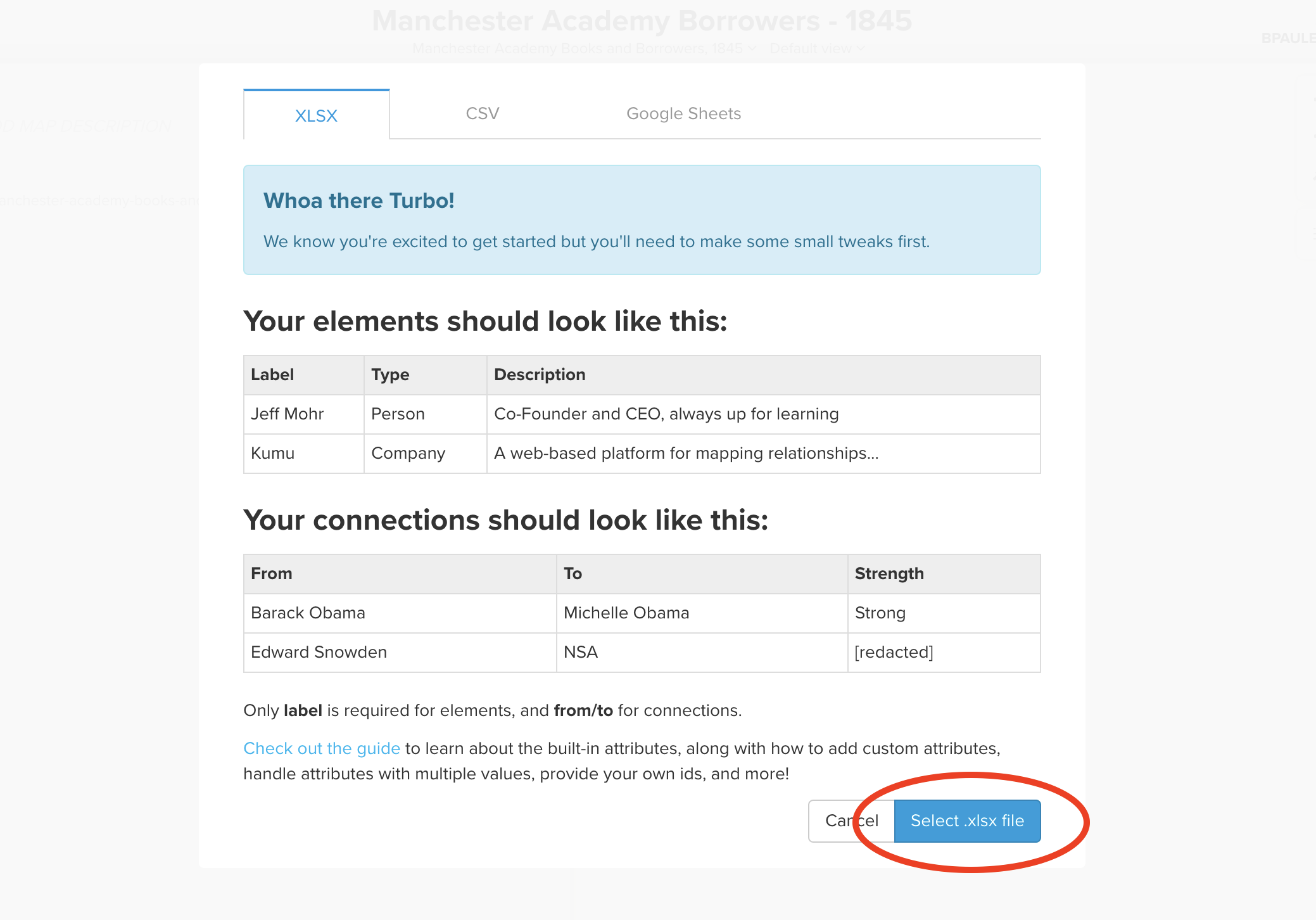
Click on the green circular plus button at the bottom of the window and select “Import.” Kumu will give you some instructions about the information you need to have in the file you’ll upload. We’re way ahead of them (that’s what Part II was for). so we can just click on the blue “Select .xlsx file” button and upload our .xlsx file.
If everything goes well, you’ll see a screen like this:
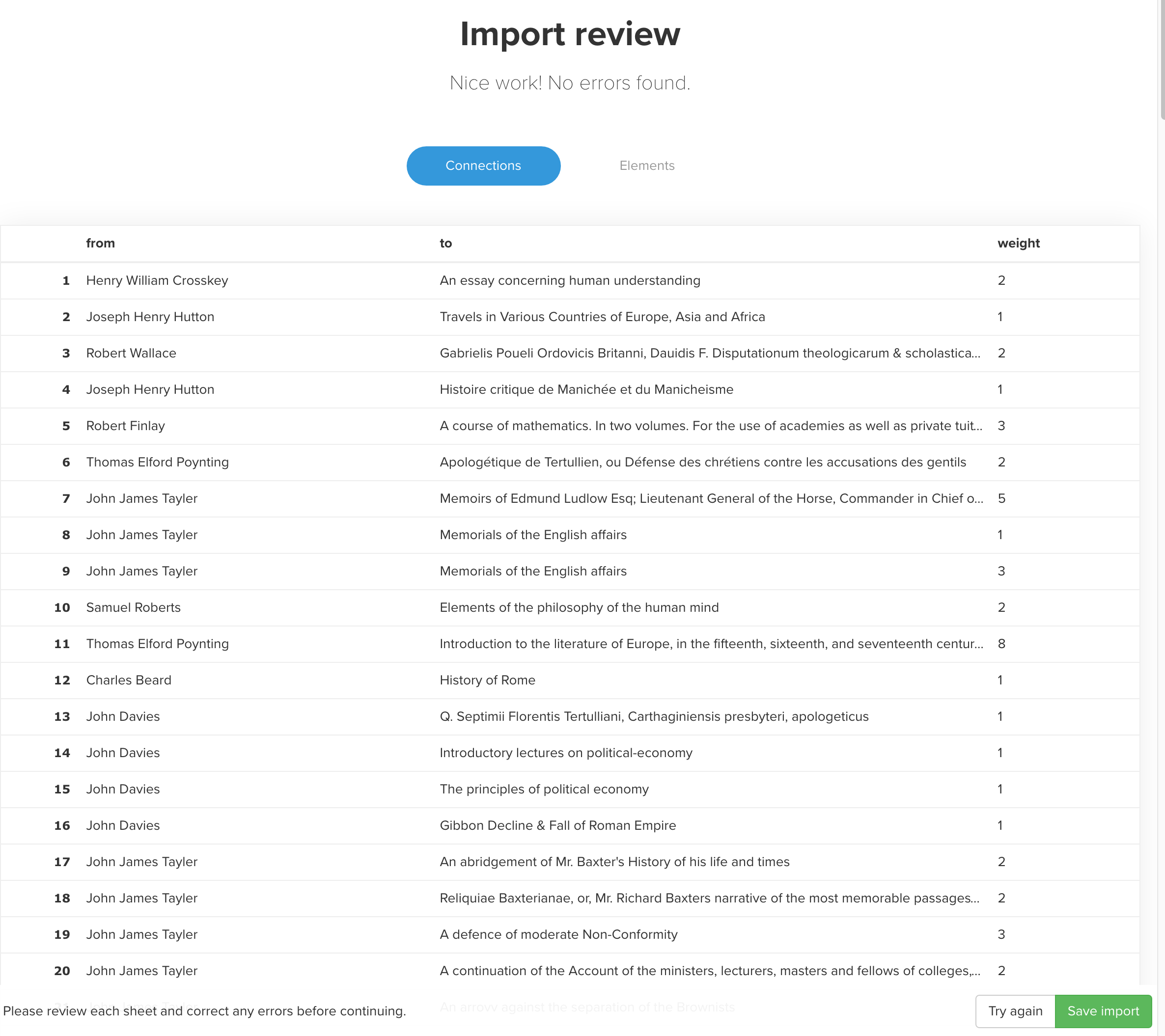
Kumu will warn you if there are any problems with the import, and you have a chance here to preview your data before it’s imported. If you run into any, fix them in your Excel file and try the upload again (I discovered an extra space after “from,” for instance). Once you’re satisfied that the data look right, go ahead and click the green “Save import button.”
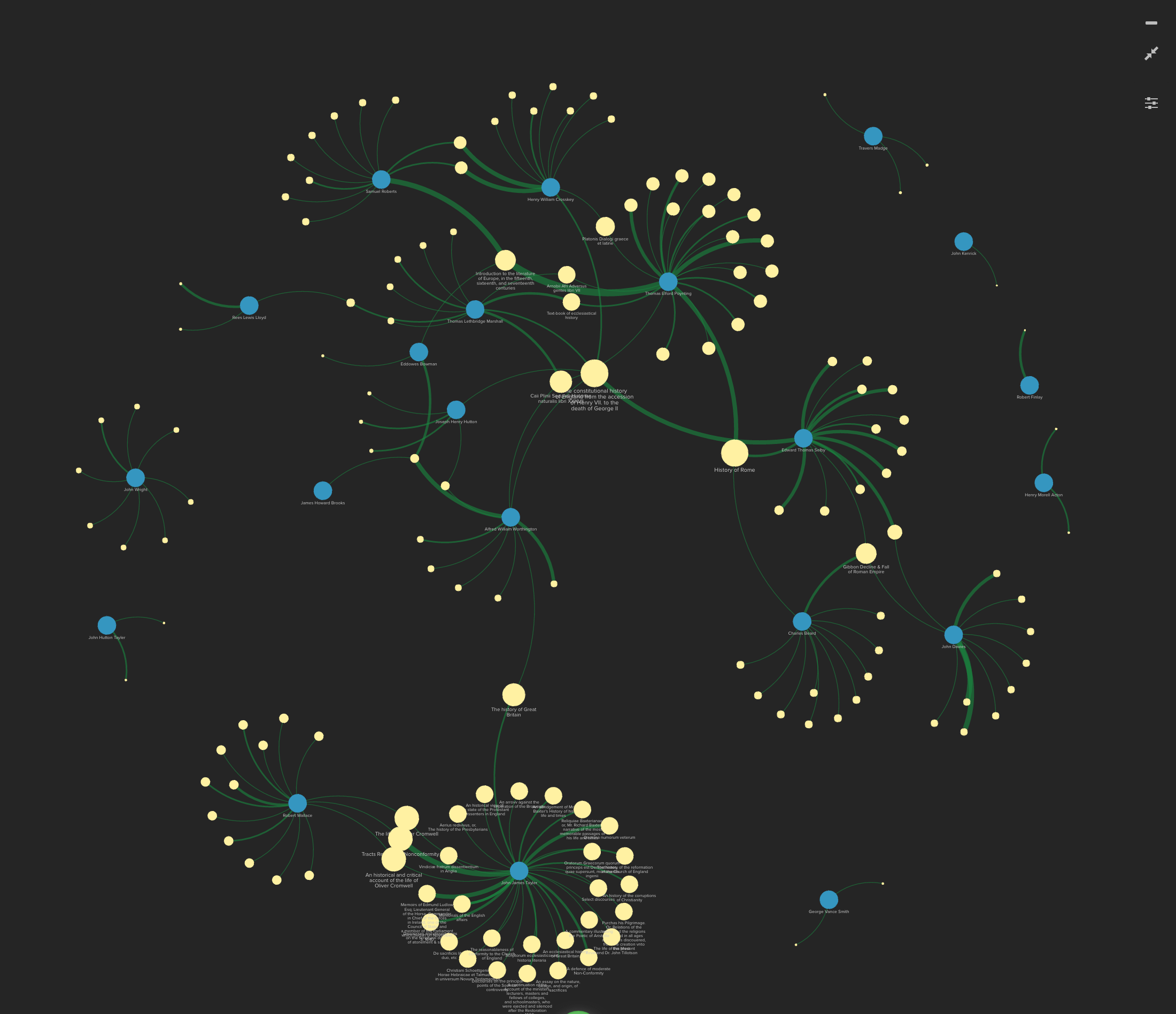
At this point, you’ll have a visualization that shows the connections between books and borrowers.
Running Social Network Analysis
Kumu offers some tools for analyzing social networks that allow us to see, for instance: which participants in a network have the greatest number of connections; which participants are connected to the greatest share of the network as a whole; and which participants are most likely to serve as links between other participants. We’re going to use one of those calculations to help us see which books might have formed the most connection points between different borrowers at Manchester Academy in 1845.
(Full disclosure: I am not at all well-versed in this kind of network analysis. I think that this is a good way to proceed, but if your project will lean on understanding social networks, we should look into finding some resources to help you understand the theory and practice of it better than I do at present.)
At the bottom right of the window (below the map), click on the “Blocks” icon and then click on “Social Network Analysis.”
In the next window, select the “Reach” metric and then click “Discover elements with deepest reach.” A progress bar will display as the calculations are performed, and then you’ll see a preview of the Reach values for the elements.
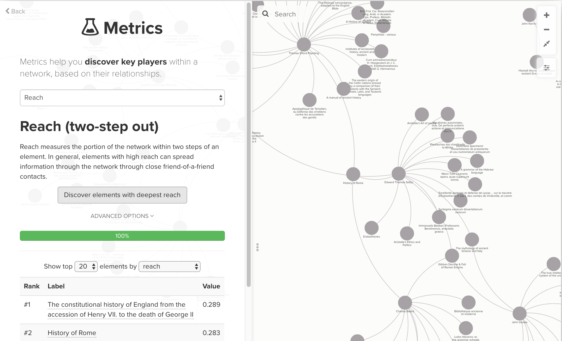
You could experiment with calculating values for different metrics, or simply have Kumu calculate all of the metrics. These values will then be available for use later. For the time being, though, let’s just stick with Reach and move on to styling the map.
Styling your visualization in Kumu
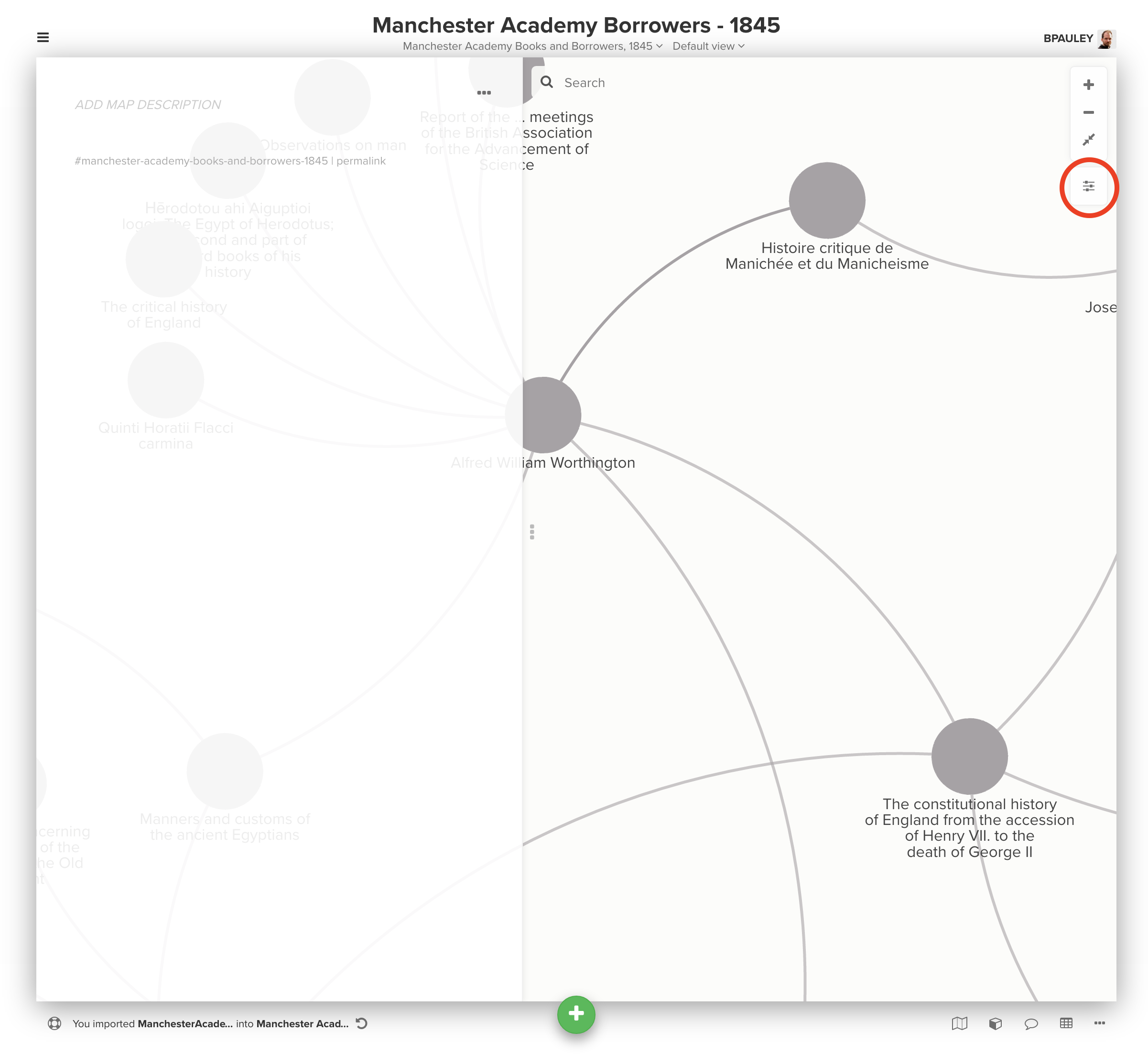
Kumu gives you a number of ways to customize the appearance of your map. Start by clicking the “Settings” icon on your map:
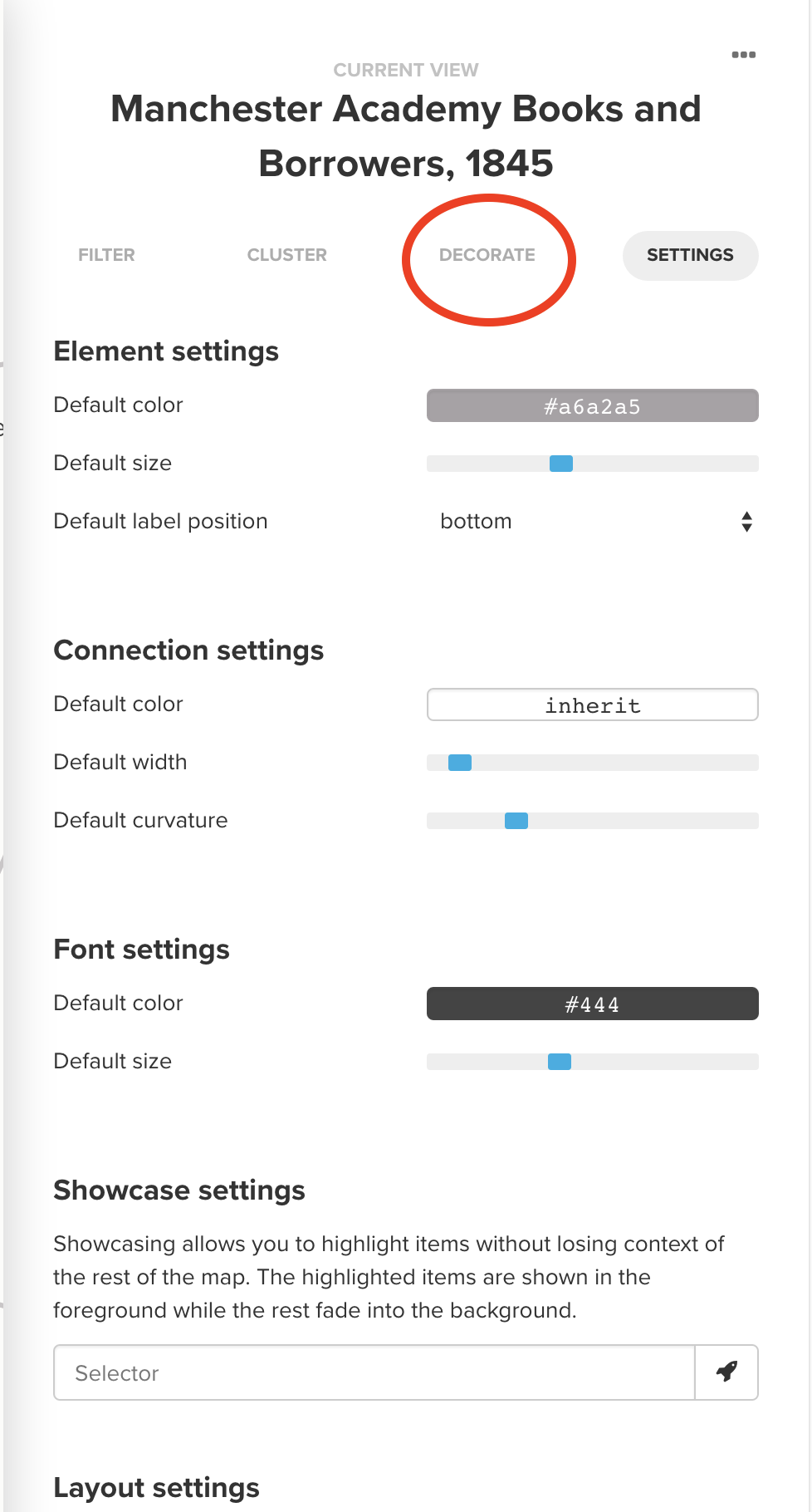
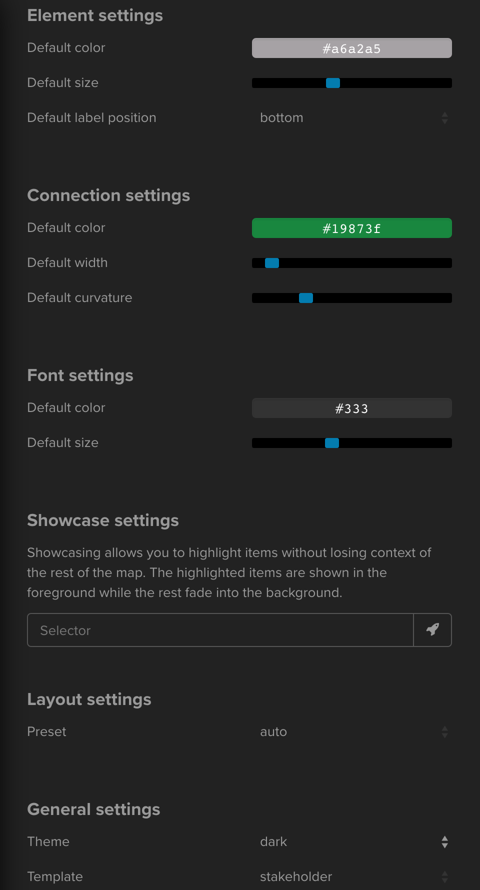
The main settings pane offers you some broad controls that affect the entire map: element and connection sizes and colors; font sizes and colors; layout settings; and so on. I’m going to forego making global changes to the styling of elements and connections at this point, because I want to style different elements and connections differently. (In the finished map, I’m going to switch from the “light” to the “dark” theme, just because I like the look of it. But I’m going to stick with the light theme for now because the screenshots are easier to read that way.)
Now I want to start styling elements and connections based on different criteria, so I’ll switch to the “Decorate” tab at the top of the Settings pane:
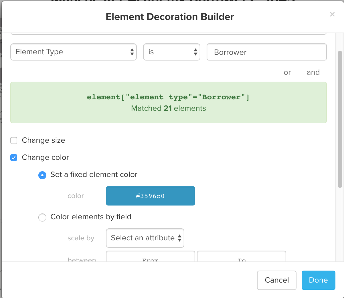
I want to make it easy to tell at a glance which circles are Borrowers and which are Books, so I click “Add element rule,” set the selector to an Element Type (you’ll have to type “Borrower” or “Book”), then click the check box next to “Change color” and set the color for the element type. Here, I’m setting the Borrower elements to appear as dark blue:
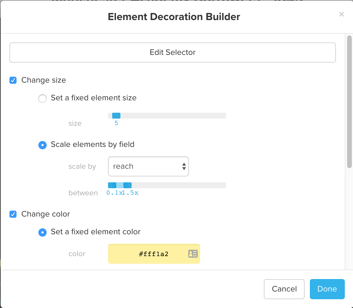
You’ll notice there are several different ways you can style elements. I’m going to style the Book elements two ways: on the one hand, I’ll make sure that all Book elements are colored yellow; at the same time, I’ll change the size of the circles for each Book element based on its Reach value, which we calculated above. (I find the default scaling of 0.5-4.0 to be a little extreme, so I’ve backed the range from 0.1 to 1.5: big enough to see the difference without being obnoxious.)
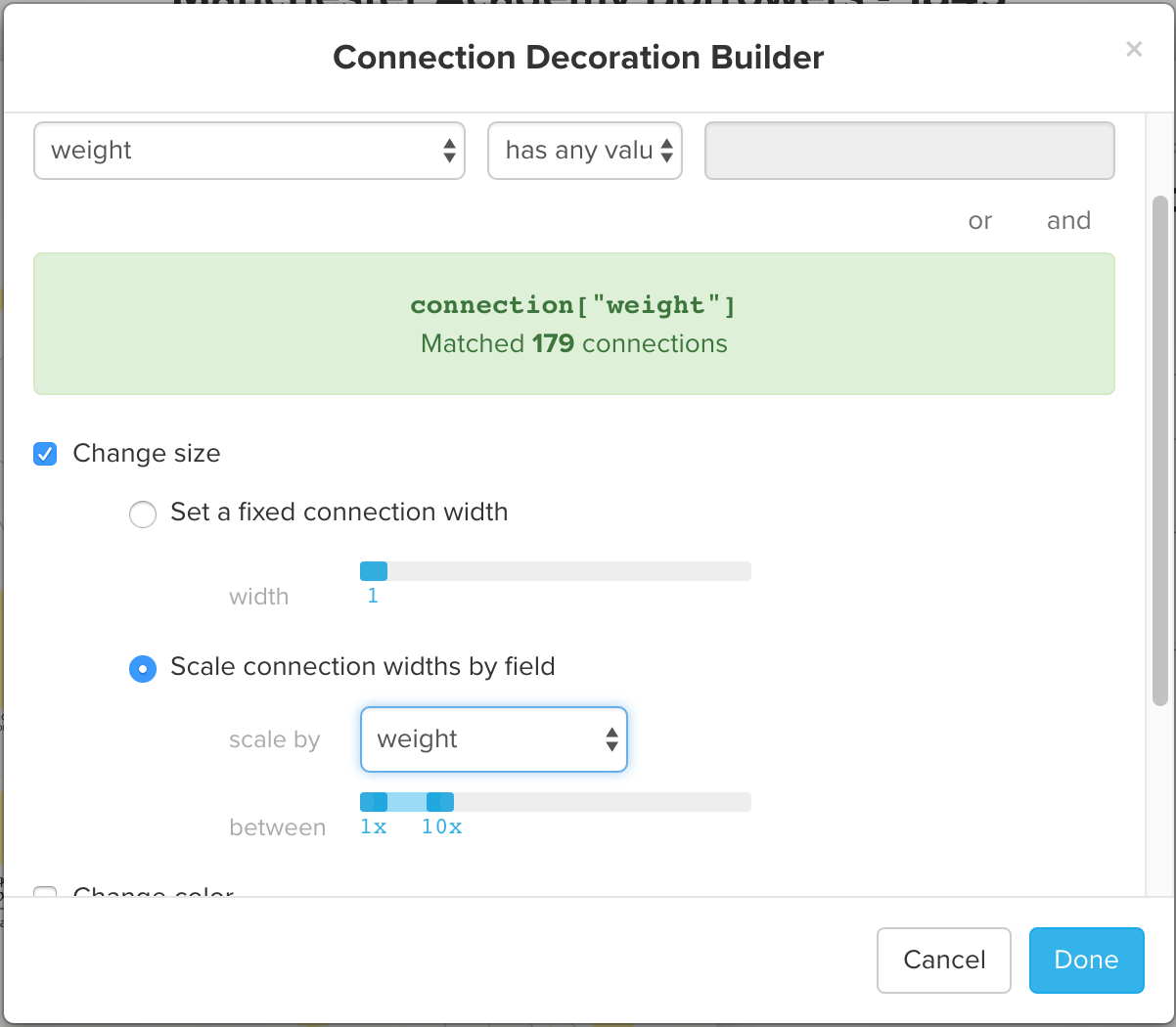
Just as with Elements, we can also style Connections by criteria we select. After going to all the trouble of calculating a weight for the number of times a Borrower borrowed a Book, it would be a shame not to do anything with that information. Click “Add connection rule,” then select “Decorate custom selection,” and indicate that you want to choose those Connections where the “weight” field “has any value.” Check the box by “Change size” and the radio button by “Scale connection widths by field,” then select scale by “weight.” (You may need to play with the amount of scaling a time or two to achieve the best look):
As I look at the resulting map, I find I don’t really care for the way that the connection lines fade from blue to yellow, so I’m going to go back to the main settings tab and set a color for all connections and, while I’m at it, switch to the “dark” theme.
If you click “Save” at the bottom of the Settings tab and then click the Settings icon to close the settings pane, you should see this: